- Key Takeaways
- Setting Up the $500,000 Three-Fund Experiment
- Why Quarterly Dividend Payments Look Erratic (But Aren't)
- Stress Testing the Portfolio: 2020 and 2022
- The Crossover Nobody Expected: DGRO Overtakes VYM
- Cash vs. Reinvested: The $245,000 Gap
- The SCHD Benchmark: Income vs. Capital
- What Eight Years of Real Dividend Checks Actually Teaches
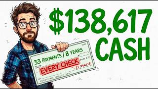
In January 2018, $500,000 went into three dividend ETFs — VYM, DGRO, and VIG — split evenly, never added to, never rebalanced, and never sold. Eight and a half years and thirty-three quarterly payments later, the full ledger tells a far more interesting story than any yield figure could. The first payment was $2,743. The most recent was $5,108. But thirteen of the thirty-three payments in between were actually smaller than the one before them, even though the portfolio never cut a single annual distribution. Understanding why requires looking at the actual payment history rather than a projected yield.
Key Takeaways
- $500,000 split evenly into VYM, DGRO, and VIG on January 2, 2018, generated $12,329 in dividend income in its first full year and $19,512 in 2025 — a 58% increase in income with zero new contributions.
- Thirteen of thirty-three quarterly payments fell from the prior quarter, including eight first-quarter declines, purely due to dividend seasonality, not portfolio deterioration.
- During the 2020 pandemic crash, the annual dividend total still rose 6% year-over-year; in the 2022 rate-shock bear market, it rose 8%.
- DGRO overtook VYM in actual income dollars in 2025, despite starting nearly $1,300 behind it in 2018 — a reversal driven entirely by compounding growth rates, not stock-picking.
- Taking distributions in cash left the portfolio worth $1,076,763 after also paying out $138,617 in spendable income; reinvesting every payment instead grew it to $1,321,631.
- A single-fund comparison against SCHD on identical capital showed the one-fund position paying over 50% more annual income by 2025, while the three-fund portfolio finished with about $72,000 more in total value.
Setting Up the $500,000 Three-Fund Experiment
The structure was deliberately simple. On January 2, 2018 — the first trading day of the year — $500,000 was split three ways, with $166,667 going into each of VYM (Vanguard High Dividend Yield), DGRO (iShares Core Dividend Growth), and VIG (Vanguard Dividend Appreciation). Every distribution since has been assumed taken in cash rather than reinvested, based on published closing prices and published distribution histories. It is a mathematical reconstruction, not a live brokerage account, and a different entry date would change every figure in this analysis.
Share Counts Locked In From Day One
VYM closed at $85.92 that morning, buying 1,940 shares. DGRO closed at $34.90, buying 4,776 shares. VIG closed at $102.39, buying 1,628 shares. Those three numbers never changed again. Every payment described in this article is simply one of those three fixed share counts multiplied by whatever each fund declared that quarter — a reminder that in a dividend growth portfolio, the share count is the asset, not the fluctuating balance.
The three funds are built to do different jobs. VYM ranks companies by forecast yield and takes the higher-paying half, prioritizing income today. VIG screens for a long record of annual dividend increases and explicitly excludes the highest yielders, prioritizing reliability of growth. DGRO sits between the two, screening several hundred companies for sustainable dividend growth with no single holding dominating. That design difference — not stock selection skill — explains nearly everything that happens to the portfolio over the following eight years.
Why Quarterly Dividend Payments Look Erratic (But Aren't)
The first full year, 2018, paid $12,329 combined — about 2.5% on $500,000, an unremarkable figure next to funds advertising 6% to 10% yields at the time. But the pattern that matters shows up almost immediately: the four 2018 quarterly payments rose steadily from $2,743 to $3,328, then the first quarter of 2019 fell to $3,136.
That drop is not a dividend cut. It's seasonality. Every single year in this eight-year window, the first quarter produced the smallest payment and the fourth quarter produced the largest. The reason is structural: ETFs like these have no board declaring a dividend — they pass through whatever their underlying holdings paid out during that specific three-month window. Companies don't coordinate ex-dividend dates, and many concentrate special or extra payments near year-end, inflating Q4 and leaving Q1 comparatively thin. The pattern repeated eight years running, and it fools new dividend investors every January.
Across thirty-three quarterly payments, thirteen were smaller than the one before. Eight of those thirteen declines were first-quarter payments. Not one was followed by a lower annual total.
Stress Testing the Portfolio: 2020 and 2022
The real test of any dividend portfolio comes in a crisis, and this one faced two very different ones. In Q1 2020, the payment fell to $3,026 from $3,608 — the single largest quarterly drop in the entire record, landing right as the market was pricing in a pandemic and household-name companies were suspending payouts that had run for decades. Everything in that moment pointed toward disaster. Instead, the full-year 2020 total came in at $14,295, up roughly 6% from 2019.
That resilience wasn't luck — it was selection. VYM, DGRO, and VIG all screen for established payment records and balance-sheet strength, which meant they were structurally underweight the companies most likely to suspend dividends during a liquidity shock. Two years later, 2022 presented a different problem entirely: rising interest rates made cash yields competitive with equities, and prices fell across the board for most of the year. Yet the annual payment rose from $15,456 to $16,725, up about 8%, with Q4 2022 setting a new record at $4,877. A portfolio whose market value was down for the year still sent its owner more cash than ever before.
The Crossover Nobody Expected: DGRO Overtakes VYM
Breaking the combined numbers apart by fund reveals the most unexpected result in the entire dataset. In 2018, VYM's share of the portfolio paid $5,139 — by far the largest of the three. DGRO's share paid just $3,873, trailing well behind. By 2025, VYM had grown to $6,791 (up about 32% over seven years), while DGRO had grown to $6,929 — up 79% — and had overtaken VYM in actual dollars of income, from identical starting capital. As recently as 2024, VYM was still ahead, $6,780 to $6,614. One year later, the order flipped and hasn't flipped back. VIG, starting from the smallest 2018 payment of $3,317, grew 75% to $5,792, tracking DGRO's growth rate closely while trailing both in absolute income.
This doesn't reverse prior warnings about high-yield funds that manufacture a headline number through price collapse, option overlays, or return of capital — those remain traps. VYM is different: its yield comes from real earnings at mature companies, it never cut its annual payment across this window, and its share price roughly doubled. It simply grows more slowly than a dedicated dividend-growth or dividend-appreciation fund, and eight years was enough time for the slower starter to catch up. Investors building a similar multi-fund approach may find it worth reviewing a DGRO vs. SCHD dividend growth comparison for a closer look at how growth-oriented funds compound over time.
Cash vs. Reinvested: The $245,000 Gap
By mid-2026, the thirty-three combined payments totaled $138,617 in cash taken out of the portfolio and spent. Despite that withdrawal, the same fixed share counts — at current prices of $161.92 for VYM, $78.26 for DGRO, and $238.94 for VIG — were worth $1,076,763, more than double the original investment, with nothing sold and nothing reinvested.
Running the identical scenario with every distribution reinvested instead produces $1,321,631 — a difference of about $245,000, which roughly equals the cash withdrawn plus what those reinvested shares went on to earn. That gap is the entire case for reinvesting dividends during the years income isn't needed, expressed as a single number. But it also reframes the cash-withdrawal result: pulling $138,617 out of a portfolio over eight years while it still more than doubles in value is not a failure. It's what an earnings-funded dividend portfolio looks like when the payment comes from company profits rather than from liquidating shares.
The SCHD Benchmark: Income vs. Capital
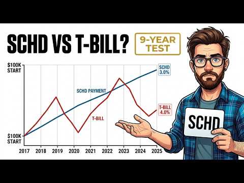
Running the same $500,000, same entry date, and same cash-distribution rule through a single fund — SCHD — produced a split result. SCHD paid $14,027 in 2018 versus the three-fund portfolio's $12,329, and by 2025 it paid $30,596 versus $19,512 — more than 50% more annual income. On capital, though, the three-fund portfolio finished ahead: $1,076,763 versus SCHD's $1,004,237, a gap of about $72,000.
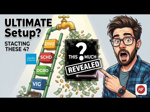
Neither result is a win or a loss — it's a function of what each structure is built to do. SCHD screens harder for yield and quality and distributes more of its return as cash; the three-fund mix holds a dividend-growth fund and an appreciation fund alongside a high-yield one, keeping more of the return inside the share price. An investor in their late sixties relying on dividends to cover living expenses would prefer the income column; someone in their fifties reinvesting everything would prefer the capital column. For readers comparing structures like this directly, the 4-ETF dividend ladder using VIG, DGRO, SCHD and DIVO lays out a similar multi-fund income approach in more detail.
What Eight Years of Real Dividend Checks Actually Teaches
The annual number is the signal; the quarterly number is noise. Eight of the thirteen quarterly declines in this record were first-quarter payments, and every one of those years still finished higher than the last. The only skill required across a pandemic, the fastest rate-hiking cycle in forty years, and a bear market was not interfering — no swapping funds, no rebalancing, no selling into a scary quarter. That said, the window analyzed here begins near the start of a long market expansion; an investor starting in 2007 instead would have faced a much longer and harder test of that same discipline.
This is a mathematical model built from published closing prices and distribution histories, using one entry date and fractional shares, with distributions assumed taken in cash. A different starting date changes every number in this breakdown, and past distribution growth does not guarantee future distribution growth. For a full payment-by-payment walkthrough of all thirty-three quarters, including the exact figures behind each year referenced above, watch the complete video breakdown on the Harry's Financial Fitness YouTube channel, where every number in this ledger is shown on screen in sequence.